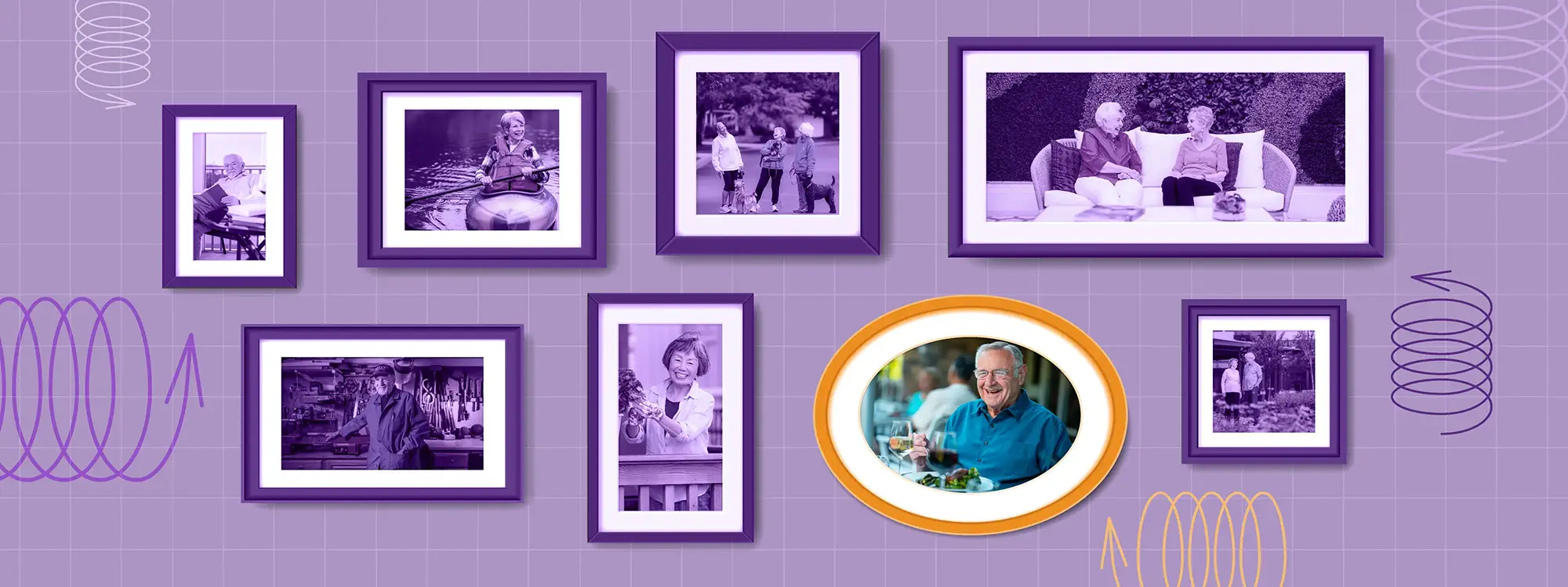
Capturing Community: The Art of Senior Living Marketing
Great creative doesn’t just show a place—it reveals what it feels like to belong there.

by Sarah Sprigings, Senior Art Director

by Bailey Browning, Art Director
Retirement communities are often perceived as offering the same things. And it’s easy to see why most senior living marketing highlights the same beautiful spaces, great amenities, caring staff, convenient location, and support for an active lifestyle. But as enticing as these may be, when your marketing uses the same language, visual style, and core ideas as the next community, you sink into a sea of sameness rather than creating your own space in the minds of your target audience. It doesn’t have to be this way.
Senior Living Communities aren’t interchangeable. Their creative shouldn’t be, either.
In senior living marketing, authenticity really matters. Every image, message and design choice should reflect the community’s personality, because prospects will notice any disconnect the moment they arrive for a tour. The sales team’s goal shouldn’t be to attract just any prospect, but the right prospect. That requires more than a one-size-fits-all approach.
Every community has elements that are unique to them. Some are full of energy. Some are very casual. Others are refined or rooted in tradition. One may feel like a boutique hotel, and the next may feel like a comfortable neighborhood. Sometimes the defining aspects of a community are fairly obvious, and sometimes they’re much more ethereal and more challenging to define—but no two communities are truly alike.
Understanding the factors that create a community’s personality is an important step in building a standout visual brand and voice. Does your community have a long, rich history? Is it located right in the heart of a large city, but maintains a beautiful park-like feel? Do you have unique midcentury modern architecture? Are your residents heavily involved in the day-to-day activities and planning of your community? Is your staff full of dedicated, long-term employees who have great connections with the residents? These questions and others can begin to bring focus to something that is hard to define—a specific feeling and sense of place that is immediately recognizable once you are there.
Capturing your community’s identity is an art
Anyone can take a picture of a building or write a list of amenities. But translating what your community feels like into compelling messaging and visual branding and determining the right communications strategy requires nuance and intent. Shortcuts don’t work. Our job as marketers is to capture what makes a community genuinely appealing and translate it into creative work that helps people picture themselves there.
Our job as marketers is to capture what makes a community genuinely appealing and translate it into creative work that helps people picture themselves there.
This approach affects more than just how you describe the community. It drives everything—your brand’s visual style, photography and videography, even your approach to social media. You’re marketing a lifestyle to people envisioning their next chapter. It’s not enough to describe the experience. You must show it.
To show what that looks like in practice, we’re highlighting three of our clients—each vastly different in location, atmosphere and amenities—and how we captured the distinct lifestyle each one offers.
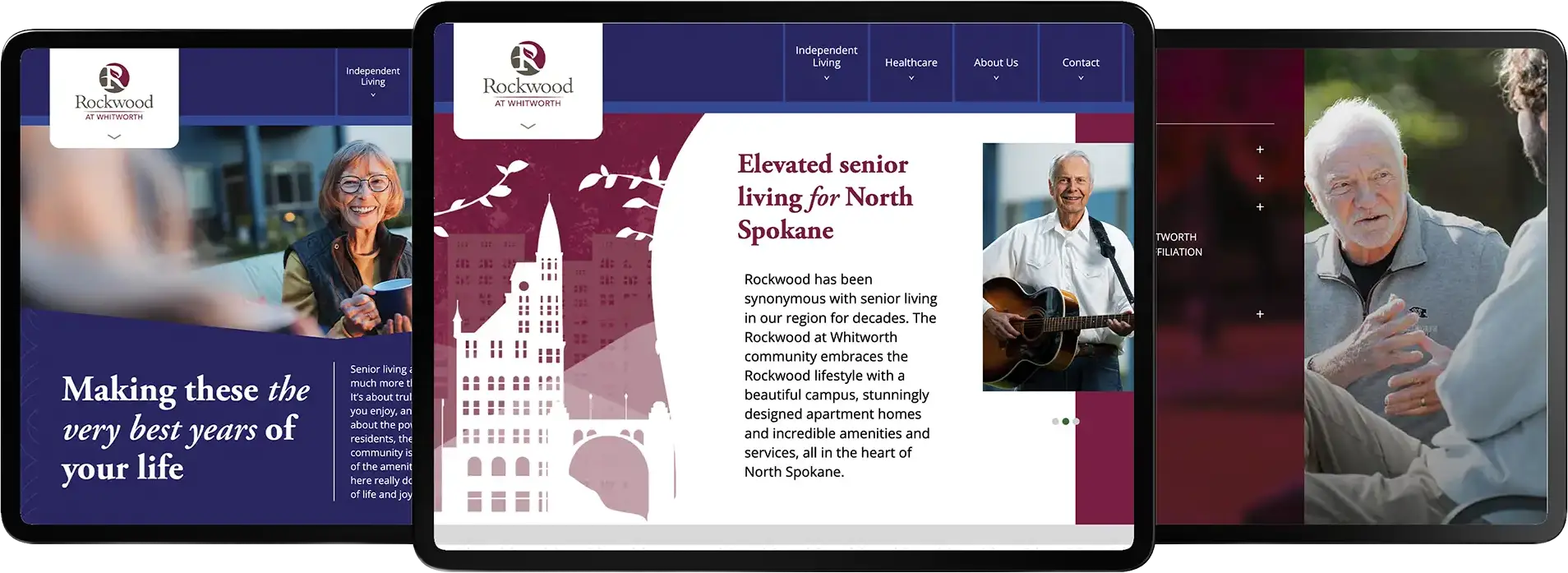
The Evergreen Curator: Rockwood Retirement (Spokane, WA)
Brand language
Confident, cultured, and quietly clever. Rockwood’s voice feels established and timeless without being traditional. They are sophisticated, thoughtful, and never overly polished.
Photography approach
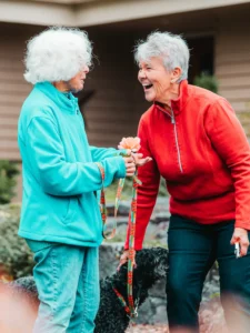
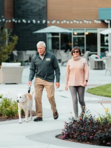
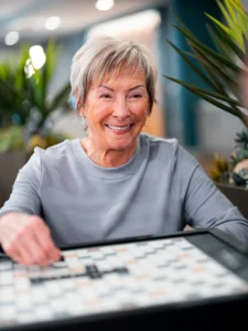
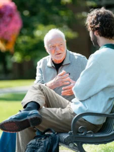
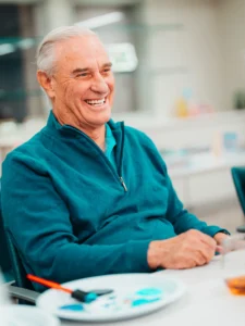
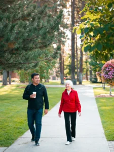
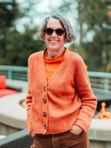
Our primary goal for this photoshoot was to showcase how residents are active participants in creating community at Rockwood. We captured them sharing meals, exchanging ideas, exploring the outdoors and connecting naturally with neighbors and team members. Rather than relying on stiff, polished poses, our photography highlights genuine relationships, personal expression and the sense that residents are the ones shaping community life daily.
Visual branding style
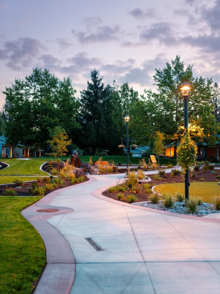
Rich textures, warm wood tones, and deep jewel tones set the mood. Midcentury-inspired interiors and Spokane’s unique and striking natural scenery give the imagery depth, character and an unmistakable sense of place.
Why it works
Rockwood residents are independent, curious, and discerning. With one campus affiliated with its neighbor university, intellectual engagement and lifelong learning are woven naturally into the lifestyle.
The creative needed to reflect a community that values thoughtful design, nature, culture and substance over flash. The result feels elevated and intentional—without trying too hard.
The Sophisticated Social Butterfly: The Outlook at Windhaven (West Plano, TX)
Brand language
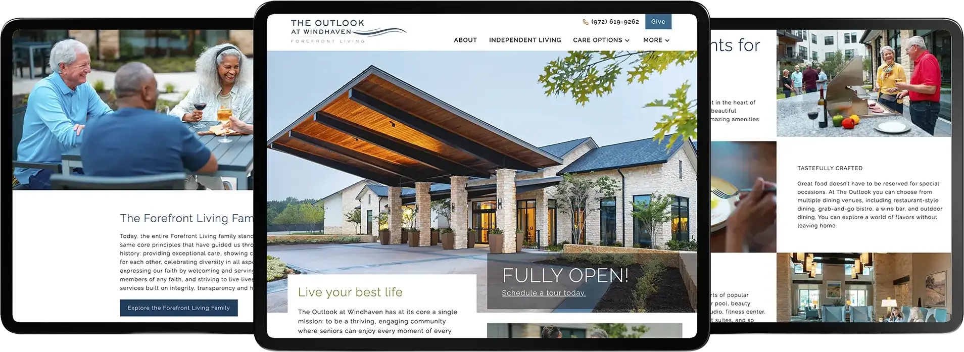
Refined, gracious and unmistakably Texan. The Outlook’s voice pairs a deep sense of hospitality with an effortless social confidence, speaking to residents who appreciate beautiful surroundings, thoughtful service and a calendar worth filling. It feels polished and sophisticated, yet always genuine and personal. All of this with a goal of reinforcing Forefront Living’s belief that Moments Matter.
Photography approach
We set out to capture quiet luxury as something lived, not simply displayed. Residents are shown sharing cocktails, gathering around beautifully set tables, welcoming friends, and enjoying quiet moments throughout the community. The imagery feels poised and aspirational, while still preserving the warmth, connection and sense of belonging that make the lifestyle feel genuine.
Visual branding style
Rich colors, confident typography, and refined details give the brand a strong, upscale presence. Spacious layouts and polished photography showcase the community’s elevated finishes, while warm textures and approachable lifestyle imagery keep the look comfortable and inviting.
Why it works
The Outlook offers sophisticated living without sacrificing the warmth of a social, close-knit community. Backed by Forefront Living, every space, amenity and detail has been thoughtfully considered to help residents thrive and create the life they want. The creative reflects that balance: impressive but personal, polished but comfortable and grounded in genuine hospitality.
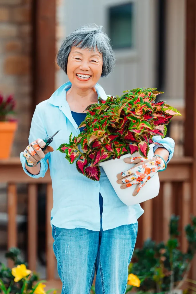
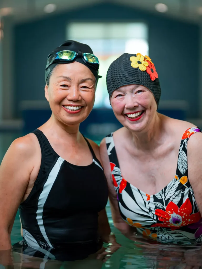
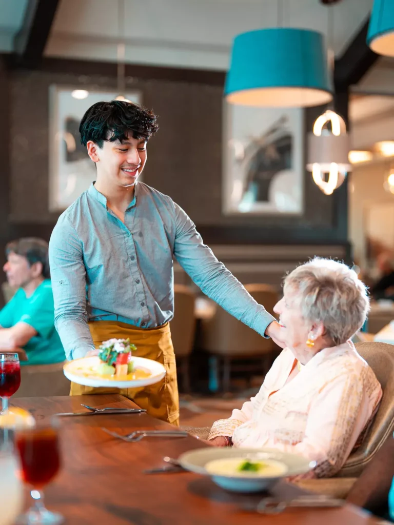
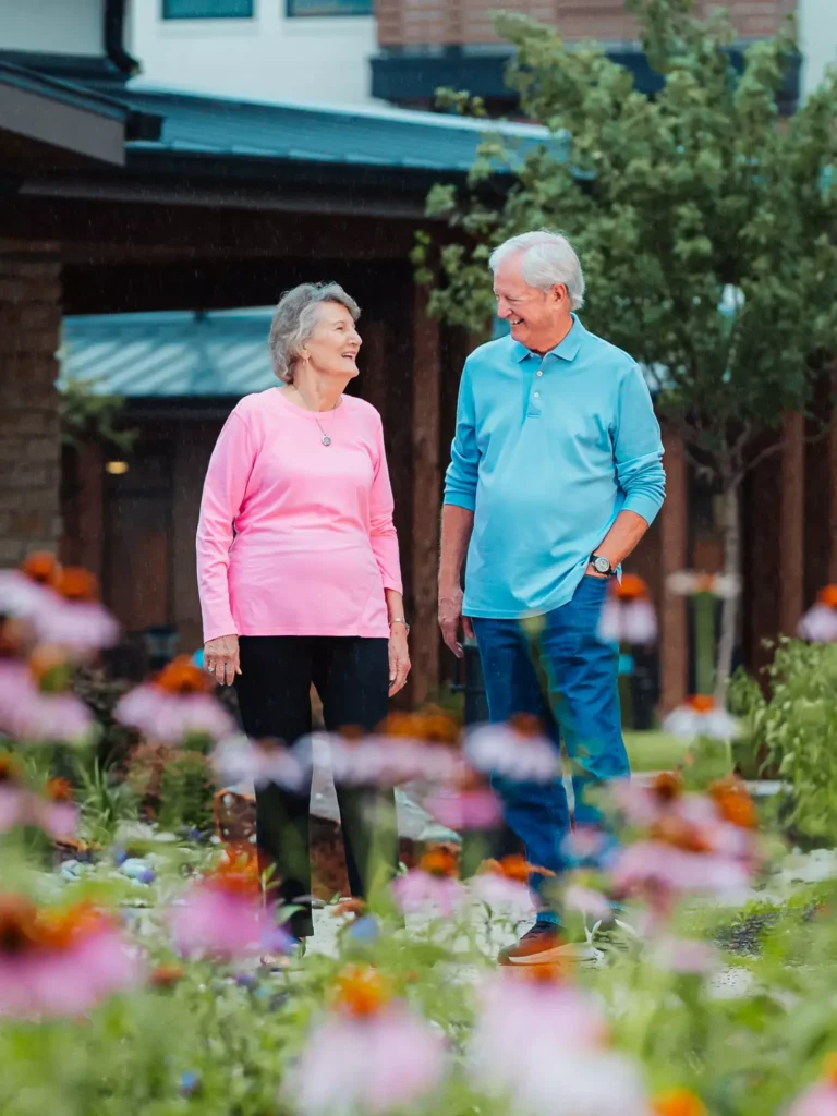
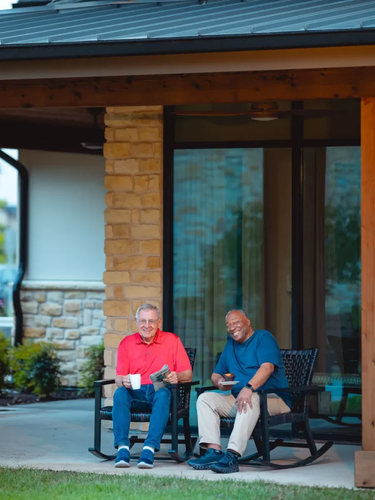
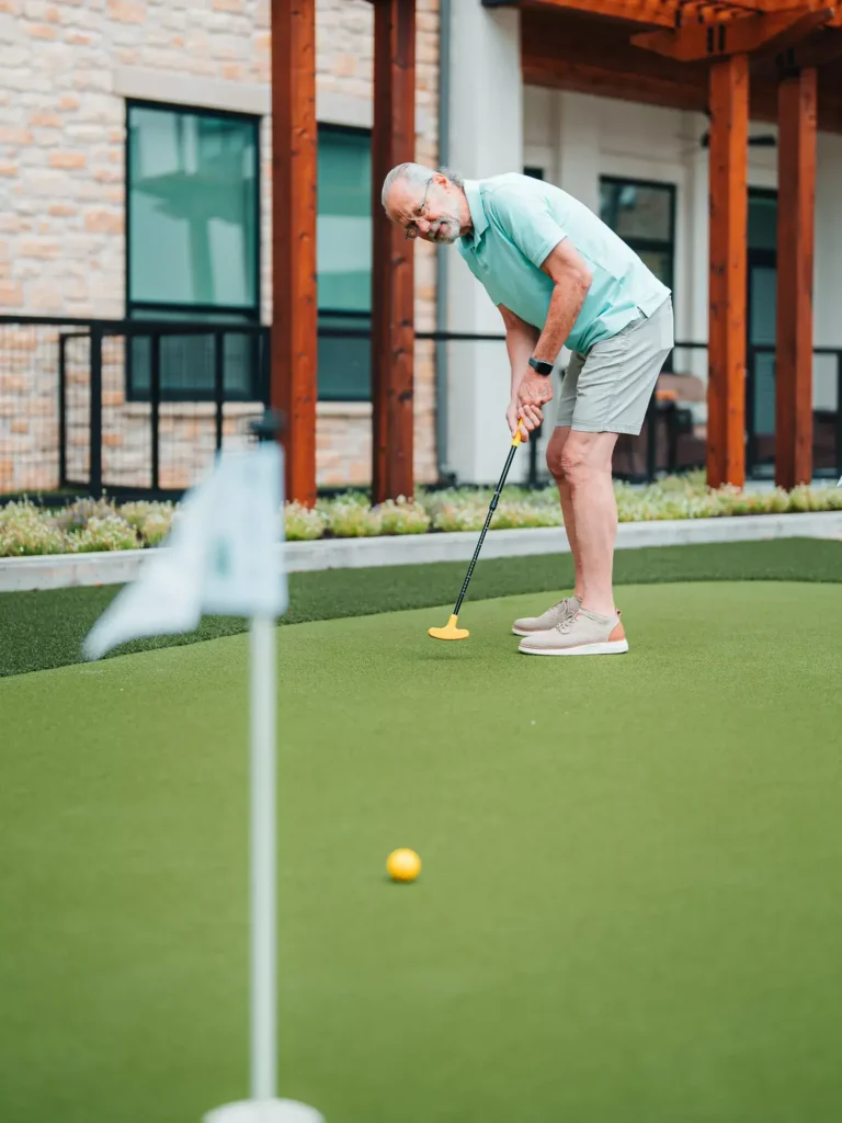
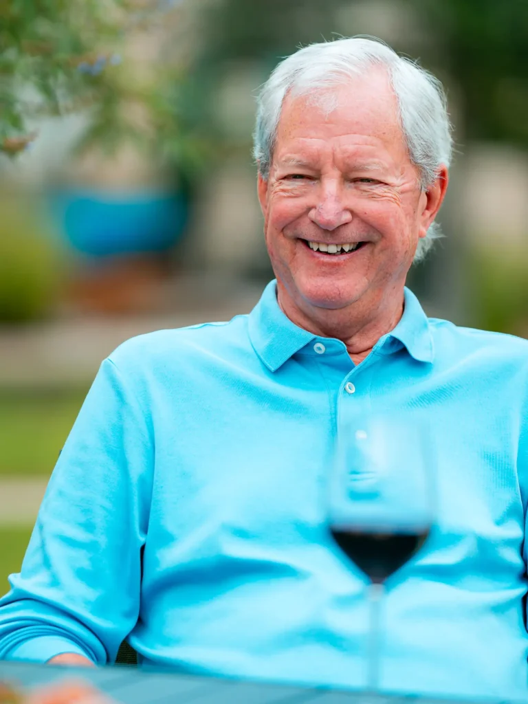
The Sunshine Scholar: Legacy Pointe at UCF (Oviedo, FL)
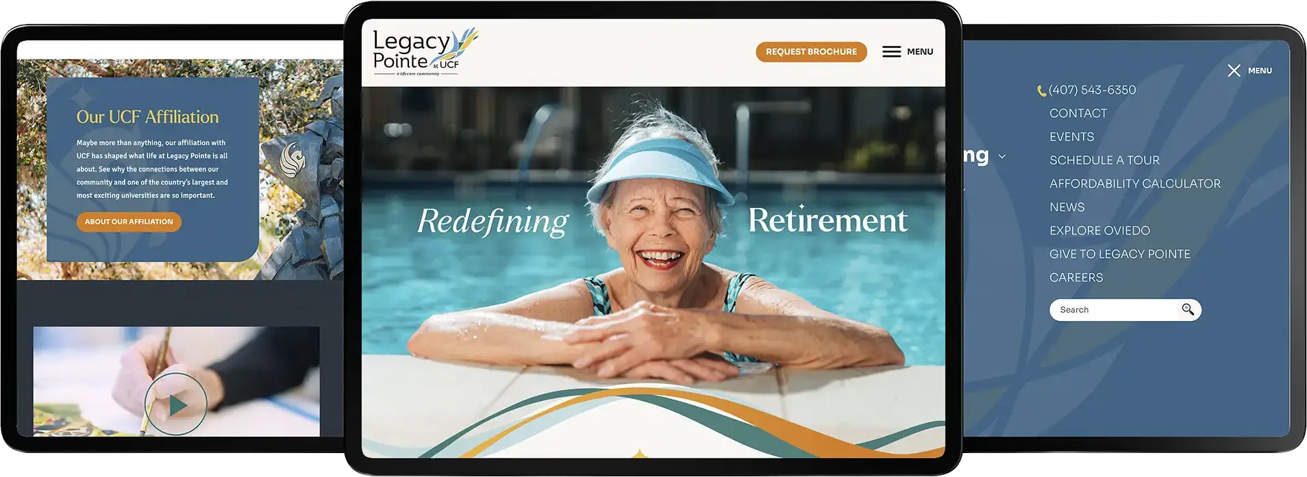
Brand language
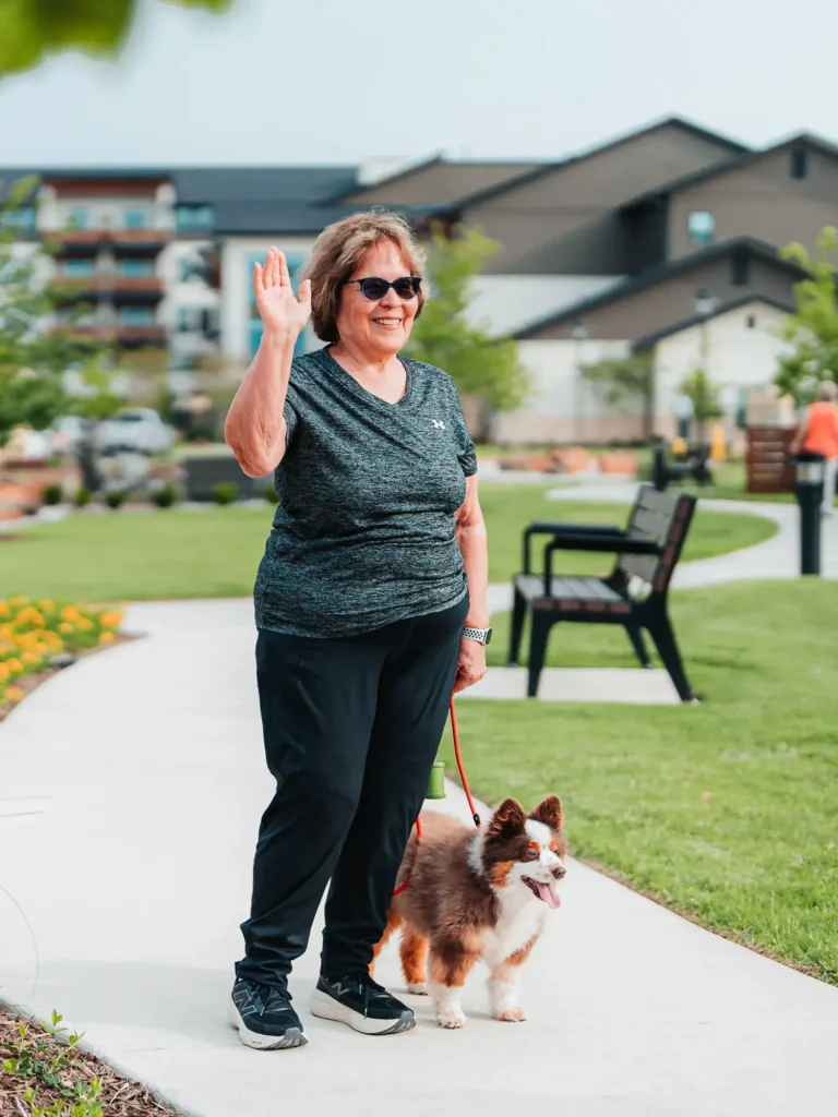
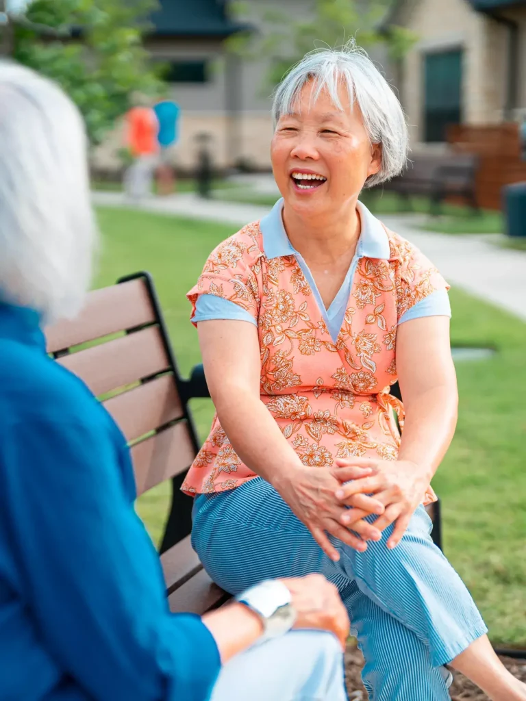
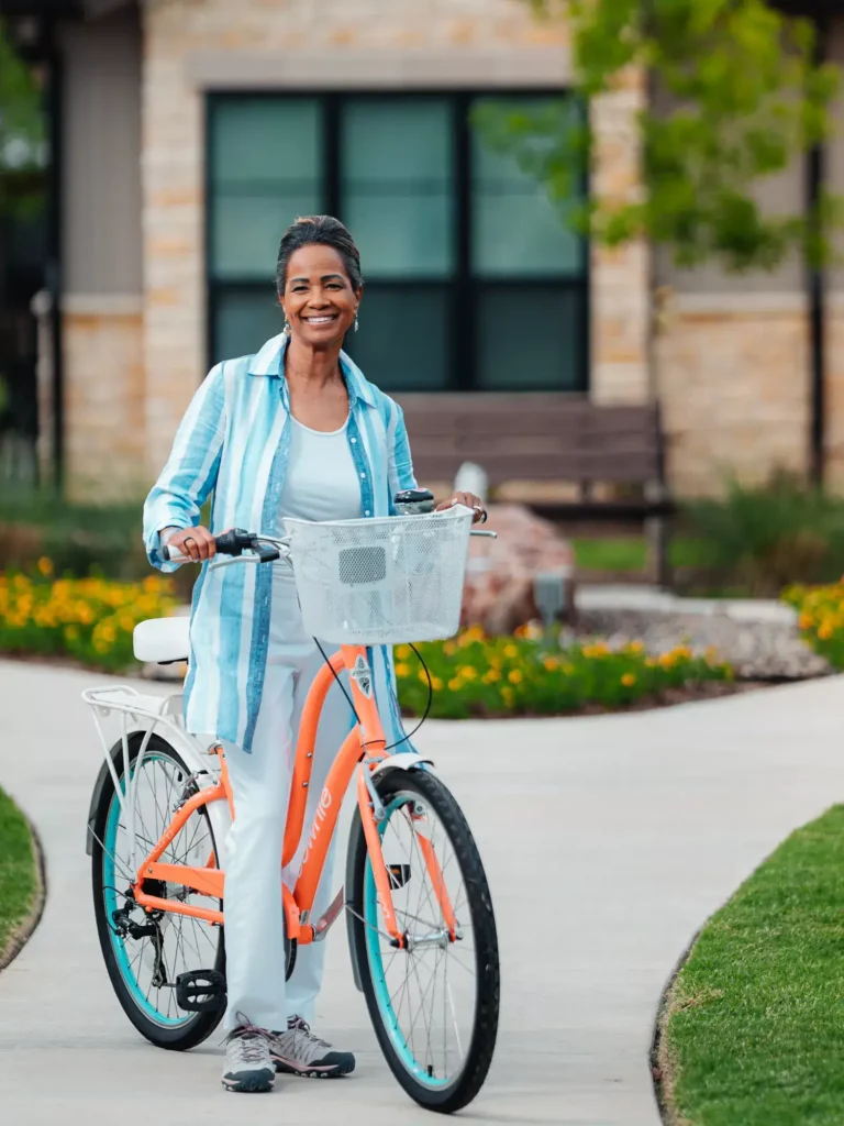
Bright, energetic and academically spirited. Legacy Pointe’s voice blends the relaxed vibe of Florida living with the lively energy of a university-affiliated community. It reflects the fact that the community is full of accomplished, interesting people who are still enjoying learning and growing and embracing all that the relationship with the University of Central Florida (UCF) has to offer.
Photography approach
We approached Legacy Pointe’s photography with a focus on movement, connection, and possibility. Residents are shown embracing the full lifestyle, whether it be learning something new, staying active, gathering with friends, and enjoying the community’s resort-style amenities. We paint a picture of a community that is carefree or approachable, without ever feeling uneventful.
Visual branding style
Vibrant colors, clean lines and generous white space create a look that feels as bright as the community’s sunny disposition. Crisp layouts and light-filled imagery bring a sense of openness, while playful pops of color reflect the energy of both the Sunshine State and the nearby UCF campus. Clean, repeating patterns add a controlled layer of texture, giving the brand visual interest without disrupting its polished, organized feel.
Why it works
Legacy Pointe residents are engaged, active and always open to what’s next. The UCF connection supports lifelong learning, while the Oviedo location and resort-style amenities make everyday life feel easy, social and fun. The creative brings those qualities together with a look that feels smart, sunny and full of energy.
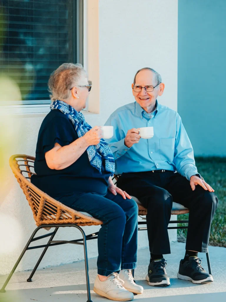
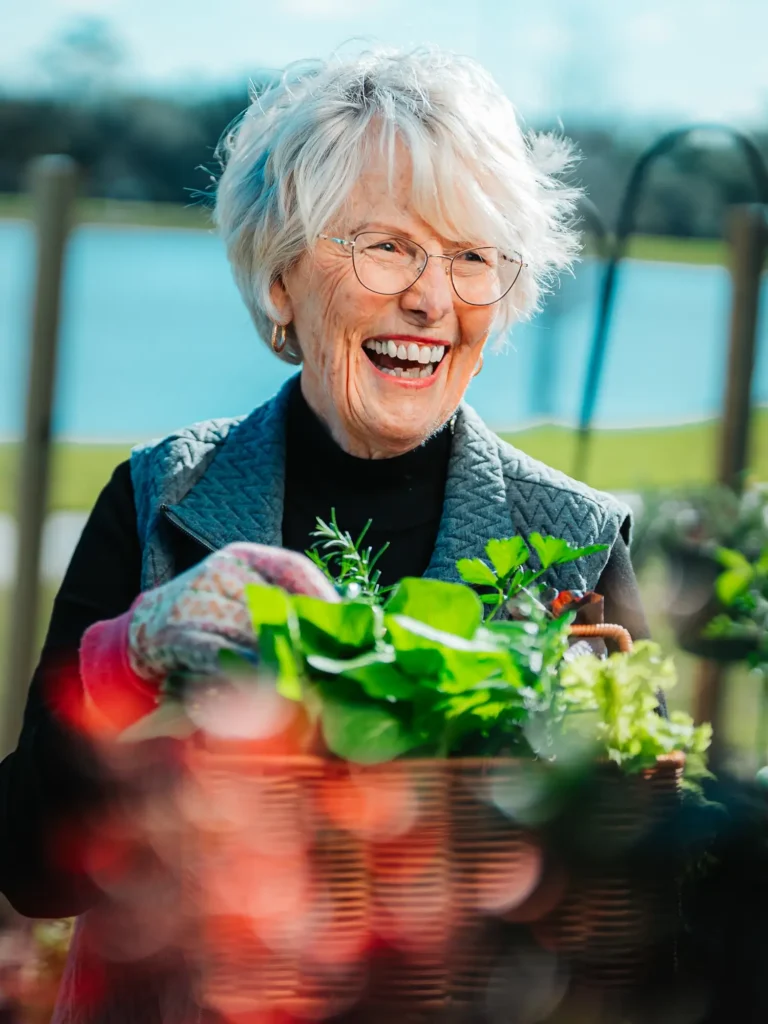
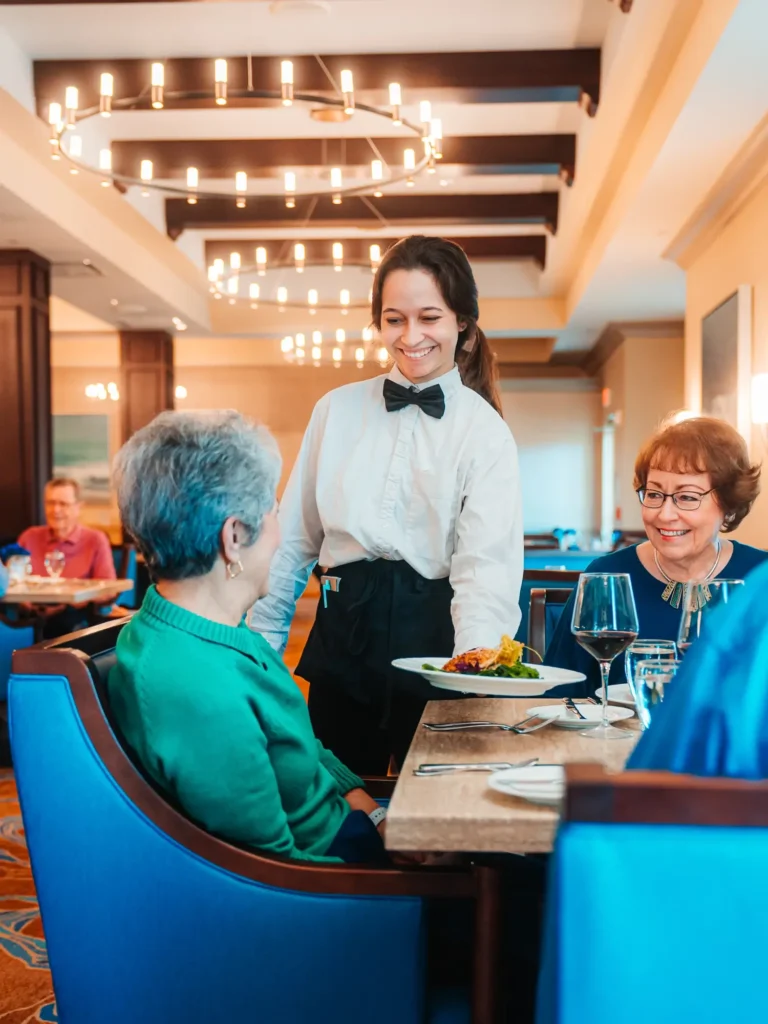
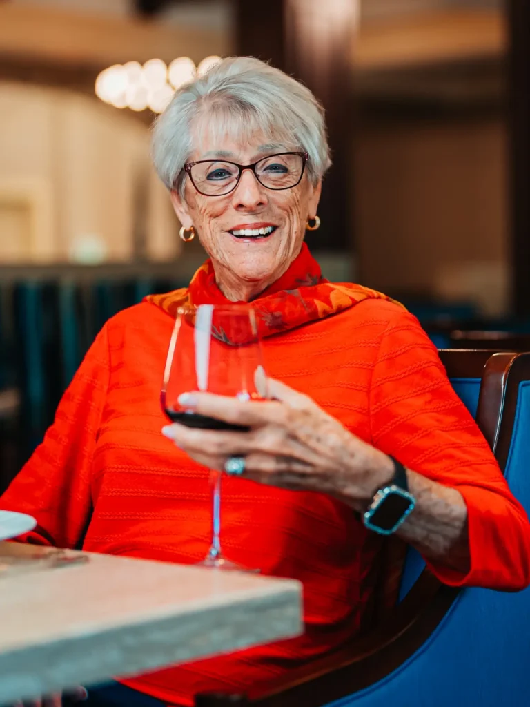
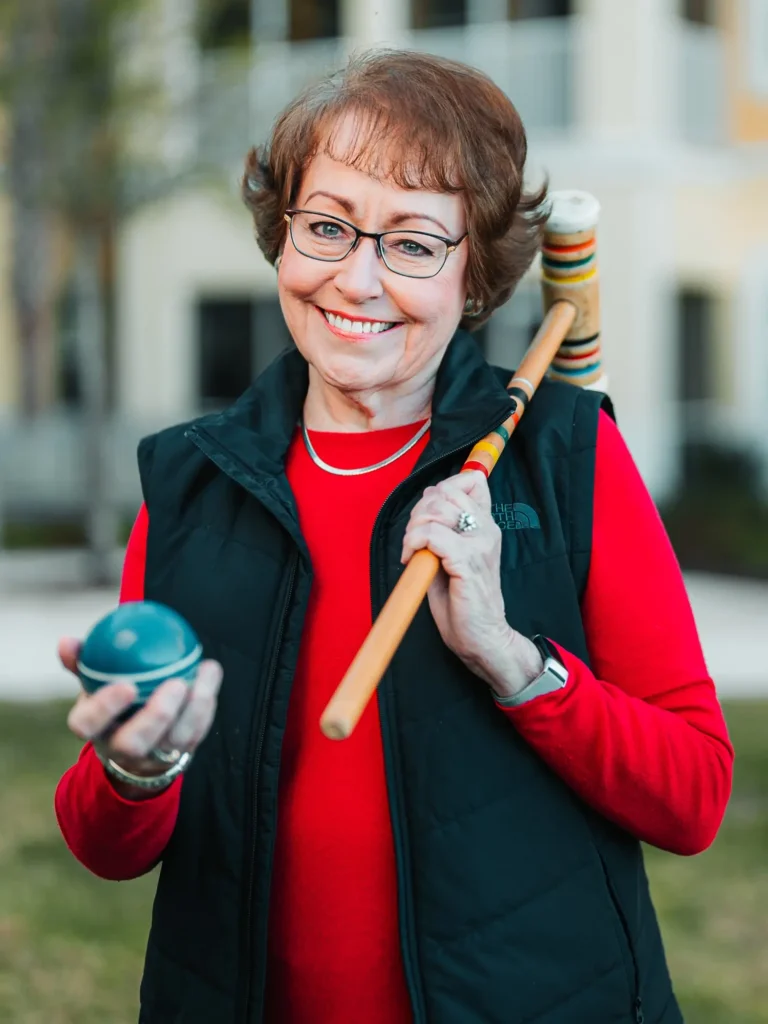
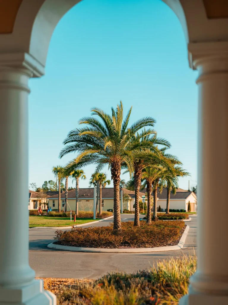
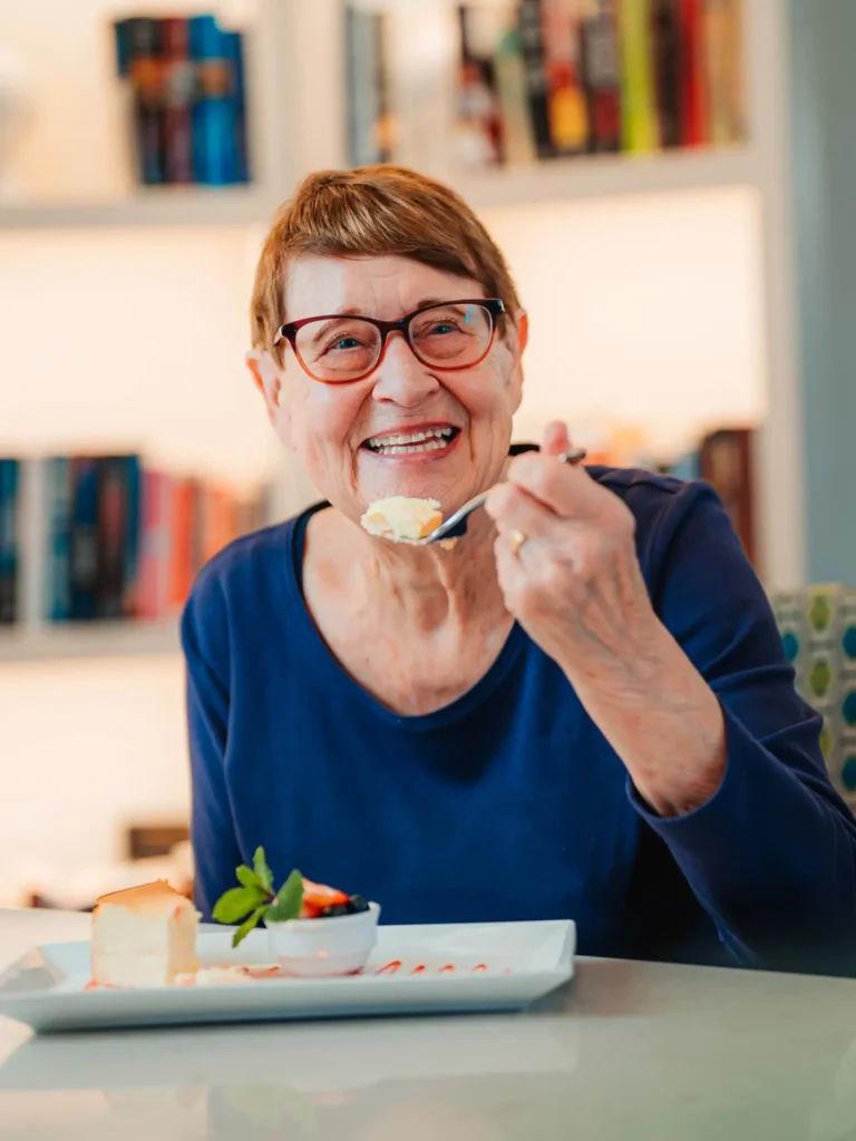
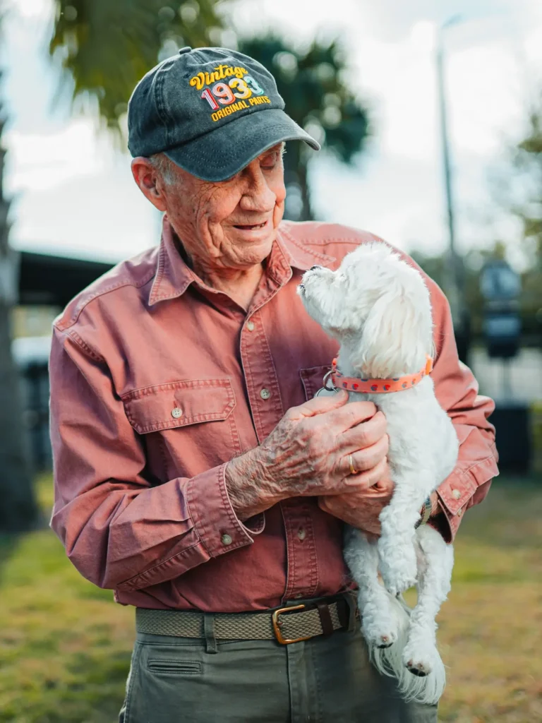
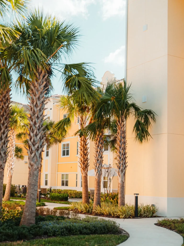
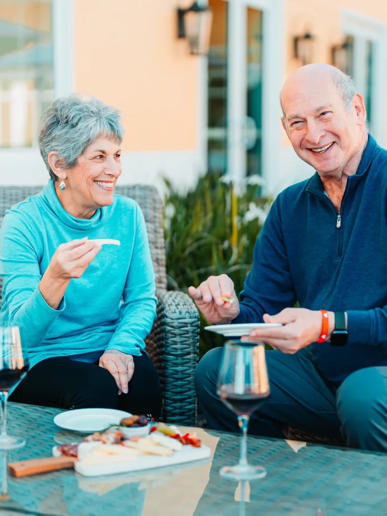
Rockwood Retirement, Legacy Pointe at UCF and The Outlook at Windhaven are all beautiful, engaging communities—but they are not at all the same experience. Each has a distinct personality, culture, and overall community feel that is exactly what make people want to call them home. With a keen eye and the right creative approach, those nuances can be captured, celebrated and used to set each community apart from the competition.
Why it matters
When choosing a community, prospects absolutely consider price, location, floor plans, care options, and amenities. But those factors are more like check boxes—they qualify your community to be in the running, nothing less, nothing more.
What people are looking for—hoping for—is to find their home. A place where they can be themselves and explore their interests. A place full of future neighbors who can be future friends. A place where they can belong.
When the creative and branding reflect your community honestly and authentically, it helps people recognize a place where they can thrive.
When the creative and branding reflect your community honestly and authentically, it helps people recognize a place where they can thrive. The emotional fit matters just as much as the financial and functional fit. The right branding builds a connection between your community and your audience from the first touch.
Your community deserves creative that reflects who you are—not who everyone else is. Capturing that takes real intention: questioning and listening, visiting your community, spending time with residents and staff, and applying our experience to recognize the details that make your community unique.

About Anstey Hodge
Founded in 2003 in Roanoke, Virginia, Anstey Hodge is a full-service marketing agency specializing in senior living. Our team is made up of marketing experts with deep experience in strategic marketing planning, brand development, digital advertising, SEO/AIO, creative campaigns, website development & interactive tools, and more. Anstey Hodge is a certified Google partner agency.
This article is just one in a series of articles sharing some of our lessons learned over the past 20+ years as leaders in the industry.